

What Is Mobile-First Design? Why Your Website Must Get This Right

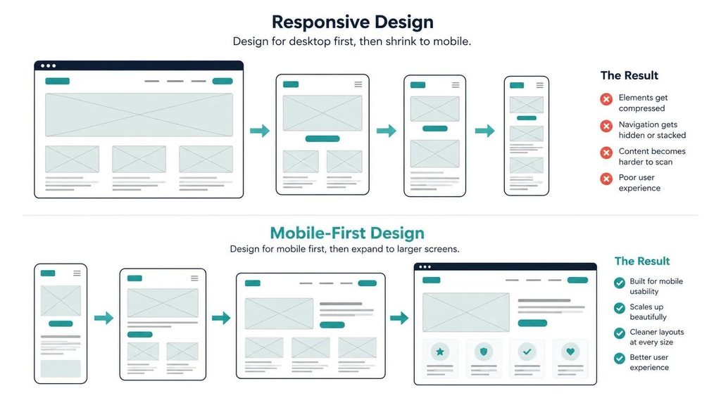
Mobile-first design is the practice of designing a website for the smallest screen first, then scaling up to tablet and desktop. It is not the same as making a desktop site work on mobile. The distinction matters because Google uses the mobile version of your site as its primary index, and more than 60% of web traffic globally now comes from phones. A site designed desktop-first and then shrunken to mobile usually has the wrong priorities built in.
Most websites are still designed the wrong way round. A designer opens a 1440px canvas, builds a full desktop layout, and then spends the last day of the project making it “work” on mobile. That approach produces a site where the mobile experience is an afterthought, and it shows.
Mobile-first design reverses that sequence. It is a fundamental shift in how web design decisions get made, not a cosmetic adjustment to the process. Here is what it means, why it matters for SEO and conversion, and what it looks like in practice.
What Does Mobile-First Design Actually Mean?
Mobile-first design means starting every design decision at the smallest screen size, typically 390px wide, which represents a modern iPhone. Layout, typography, navigation, content hierarchy, and calls to action are all designed to work on that canvas first.
Once the mobile layout is complete and functioning, the designer progressively enhances it for larger screens: tablet (768px), desktop (1280px+). Features or content that cannot fit on mobile are either cut, restructured, or moved to a secondary position.
The practical effect is a set of design priorities that are different from desktop-first. On mobile, a navigation menu becomes a hamburger icon. A four-column feature grid becomes a single column. A sidebar disappears or moves below the main content. These are not workarounds. They are the primary design, and the desktop layout is the enhancement.
How Is Mobile-First Design Different from Responsive Design?
These terms are often used interchangeably and they are related, but they describe different things.
| Responsive Design | Mobile-First Design | |
|---|---|---|
| Definition | The site layout adapts to different screen sizes using flexible grids and CSS media queries | The design process starts at mobile and scales up, not the reverse |
| Starting point | Often designed desktop-first, then made responsive | Designed small-screen-first, then enhanced for larger screens |
| Result quality on mobile | Variable; depends on how carefully the mobile version was considered | Consistently better; mobile is the primary design, not the adaptation |
| Google’s preference | Responsive is supported; mobile-first indexing applies regardless | Aligns directly with how Google crawls and indexes your site |
| CSS approach | Uses max-width media queries (desktop down) | Uses min-width media queries (mobile up) |
A site can be responsive without being mobile-first. Responsive means the layout changes with screen size. Mobile-first means the small screen was the starting reference point for every design decision. The second approach consistently produces better mobile experiences because mobile constraints shape the core design rather than being solved retroactively.
Why Does Google Require Mobile-First Design?
Google switched to mobile-first indexing in 2019 and completed the rollout across all sites in 2023. What this means in practice: Google’s crawler uses the mobile version of your site to determine how it should rank, not the desktop version.
If your mobile site has less content than your desktop site, Google only sees the mobile content for ranking purposes. If your mobile layout has broken structured data, missing headings, or unindexable content, those problems directly affect your rankings.
For SEO and digital marketing purposes, the mobile version of your site is your site as far as Google is concerned. Investing in desktop design while neglecting mobile is optimizing for the version Google does not use.
What Does Mobile-First Design Look Like in Practice?
The design decisions that change when you start mobile-first tend to cluster around four areas.
Navigation
A full horizontal navigation bar does not exist on mobile. Mobile-first design means deciding on the navigation pattern for small screens first: a hamburger menu, a bottom navigation bar, or a simplified set of top-level links. That decision then informs how the desktop navigation is structured, rather than the desktop navigation being the reference point.
The result is usually cleaner navigation overall. Desktop-first sites often accumulate navigation items because the bar can accommodate them. Mobile-first sites force prioritization from the start.
Content Hierarchy
On a desktop, you can place content side by side: a headline and a form, an image and a paragraph, a sidebar and a main column. On mobile, everything stacks vertically. Mobile-first design forces you to decide: what order does content appear in when it stacks? That order reveals what actually matters most.
Businesses that go through this exercise often discover their desktop layout buries the most important content in a sidebar or a secondary column that drops below the fold on mobile. Fixing the hierarchy for mobile usually improves the desktop layout as a side effect.
Typography and Tap Targets
Mobile-first design sets minimum font sizes for readability on small screens (typically 16px body text) and minimum tap target sizes for interactive elements (Google recommends 48px x 48px for buttons and links). These minimums then carry through to the desktop layout, which produces more readable, accessible designs overall.
- Body text: 16px minimum on mobile; 18px is more comfortable for extended reading
- Button height: 44-48px minimum for reliable tapping without zooming
- Line spacing: 1.5x line height minimum for mobile readability
- Contrast ratio: 4.5:1 minimum for normal text (WCAG AA standard)
Performance Prioritization
A mobile-first approach assumes a slower connection and a less powerful processor. That assumption pushes design decisions toward lighter page weight: fewer large images above the fold, critical CSS loaded first, non-essential scripts deferred. These decisions benefit Core Web Vitals scores on both mobile and desktop. A site designed mobile-first is almost always faster than one designed desktop-first and then adapted.
Alt Text: Smartphone mockup showing a mobile-first website layout with thumb reach zone and large tap targets highlighted
How Do You Tell If Your Current Site Is Truly Mobile-First?
These five checks will give you a clear picture.
| Check | How to Run It | What a Pass Looks Like |
|---|---|---|
| Google Mobile-Friendly Test | search.google.com/test/mobile-friendly | No mobile usability issues flagged |
| PageSpeed Insights mobile score | pagespeed.web.dev | Score above 70 on the Mobile tab |
| Core Web Vitals in Search Console | Google Search Console > Experience | LCP, INP, and CLS all showing green (Good) |
| Manual phone test | Open your site on a real phone, no Wi-Fi | All text readable without zooming; all buttons tappable without zooming; no horizontal scroll |
| Content parity check | Compare mobile and desktop versions of key pages | Mobile version has the same key content, headings, and structured data as desktop |
The manual phone test is the most revealing. Use a mid-range Android phone on a 4G connection, not your own premium device on Wi-Fi. That is the experience your median visitor has, and it is usually significantly different from what the team sees during development.
Does Mobile-First Design Cost More to Build?
Not inherently. A well-run web design project that starts mobile-first does not cost more than one that starts desktop-first. The total design and development time is similar. What changes is the sequence and the reference point for decisions.
Where cost does increase is when a desktop-first site needs to be retrofitted for mobile after launch. Responsive patches applied to a fundamentally desktop-first design often produce inconsistent results that require repeated rounds of fixes. A clean mobile-first rebuild costs less in the long run than years of ongoing mobile fixes.
For businesses planning a new site or a redesign, specifying mobile-first as a requirement in the brief is the most cost-effective approach. It sets the right expectation from the start rather than requiring course correction mid-project or post-launch.
What About Mobile Apps? Is Mobile-First Design the Same Concept?
Related but different. Mobile-first web design is about websites adapting to phone screens. Mobile app development produces a native application that runs directly on iOS or Android, with no desktop version to compare against. Apps are inherently mobile-first by definition.
Where the concepts connect is in UI/UX design principles: touch targets, thumb zones, gesture navigation, and performance on cellular connections all apply equally to mobile-optimized websites and native apps. A designer working across both disciplines applies the same principles with different tools.
If your business is evaluating whether a mobile-optimized website or a native app better serves your users, the answer usually depends on how often users will return, whether offline access matters, and whether you need device features like camera or push notifications that websites cannot reliably access.
Frequently Asked Questions
When did mobile-first design become the standard approach?
The concept was introduced by Google’s Luke Wroblewski in 2009 as a design philosophy, and it became a practical necessity as smartphone adoption accelerated. Google’s mobile-first indexing rollout began in 2018 and was completed for all sites in 2023, making it a technical requirement rather than a best practice. Most professional web designers have operated mobile-first as their default for several years. If a design proposal does not mention mobile-first approach explicitly, it is worth asking how mobile is handled in their process.
Does mobile-first design affect e-commerce sites differently?
Significantly. E-commerce sites have more complex mobile design requirements than brochure sites: product image galleries that work on touchscreens, checkout flows that minimize typing, cart management that works with one thumb, and payment methods (Apple Pay, Google Pay) that are mobile-native. Research from Baymard Institute consistently shows that mobile checkout abandonment rates are higher than desktop, primarily because of poor mobile UX rather than intent differences. Mobile-first design for e-commerce is not optional.
Can I make my existing desktop-first site mobile-first without a rebuild?
Sometimes, but rarely cleanly. If the site is built on a modern CMS like WordPress with a responsive theme, a skilled developer can rework the CSS to shift from desktop-first to mobile-first media queries and make meaningful improvements without a full rebuild. If the site uses an outdated framework, a rigid page builder, or a theme with hardcoded desktop assumptions, a rebuild is more cost-effective than a retrofit. Get a technical assessment first before committing to either approach.
What is the difference between mobile-first and mobile-only?
Mobile-first design produces a site that works excellently on mobile and scales gracefully to tablet and desktop. Mobile-only would mean building only a mobile experience with no desktop consideration, which is rare and generally unsuitable for business websites. The progressive enhancement model of mobile-first means desktop users also get a well-designed experience. It is not a trade-off.
How does mobile-first design affect loading speed?
Positively and directly. Designing with mobile constraints in mind produces lighter pages by default: images sized for smaller screens, fewer decorative elements, deferred non-critical scripts. These decisions improve Core Web Vitals scores on both mobile and desktop. A site designed mobile-first typically scores 15-25 points higher on Google PageSpeed Insights mobile than an equivalent site adapted from a desktop-first design.
Mobile-first design is not a trend. It is the baseline expectation for any website built in 2026. Google uses the mobile version for indexing. More than 60% of your visitors arrive on a phone. The design process needs to reflect that reality from the first wireframe, not as a post-production fix.
If your current site was built desktop-first and the mobile experience shows it, that is the clearest signal that a redesign conversation is worth having.
If you want to know how your current site performs on mobile and what a mobile-first redesign would involve, talk to TruTransit Solutions. We start every project with mobile as the primary canvas, and we can tell you quickly whether your current site needs a fix or a fresh start.