

Web Design for E-Commerce: Features That Reduce Cart Abandonment
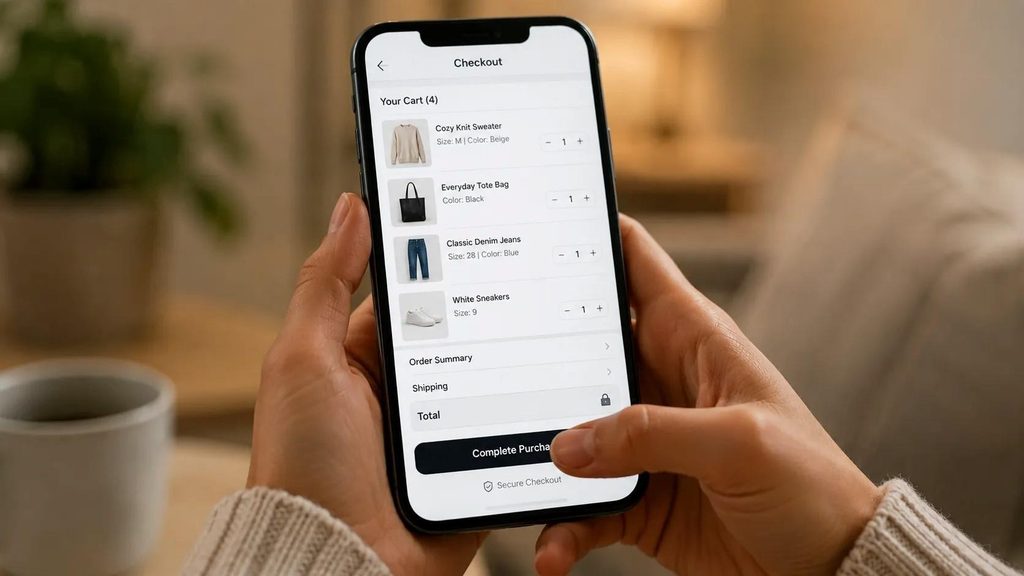
The e-commerce web design features that most reliably reduce cart abandonment are: guest checkout as the default option, shipping costs shown before the cart page, one-page or two-step checkout, Apple Pay and Google Pay alongside card payments, a visible and specific return policy on product pages, fast mobile load speed, and a persistent cart that saves items across sessions. Together these address the specific anxieties and friction points that cause 70% of shoppers to leave without buying.
Cart abandonment averages 70.19% across e-commerce globally according to the Baymard Institute’s 2024 research. Seven in ten people who add something to their cart leave without buying.
Most of that abandonment is not because people changed their minds about wanting the product. It is because something in the design or checkout flow created enough friction or uncertainty to make stopping easier than continuing.
The good news: the design decisions that fix this are known, documented, and implementable. They are not about aesthetics. They are about removing barriers from the path between ‘I want this’ and ‘I bought this.’ These principles should inform any e-commerce development project from the start.
What Are the Most Common Reasons Shoppers Abandon Their Cart?
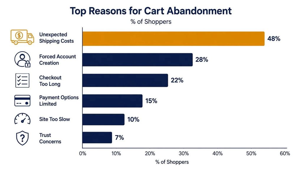
| Reason for Abandonment | % of Abandonments (Baymard, 2024) | Design Fix |
|---|---|---|
| Extra costs (shipping, tax) too high or shown too late | 48% | Show total cost including shipping on product pages |
| Forced account creation | 26% | Make guest checkout the default; offer account creation after purchase |
| Checkout process too long or complicated | 22% | Reduce checkout to 3 steps or fewer; auto-fill where possible |
| Could not trust the site with credit card info | 18% | SSL badge, payment logos, and security messaging visible at checkout |
| Delivery too slow | 23% | Show estimated delivery date on product pages and at cart |
| Website had errors or crashes | 17% | Load testing and regular QA across devices and browsers |
| Return policy not satisfactory | 16% | Clear, specific, easy-to-find return policy on every product page |
| Not enough payment methods | 11% | Add Apple Pay, Google Pay, Buy Now Pay Later alongside card payments |
Notice that most of these are not about the product, the price, or the brand. They are about information that was missing, friction that appeared at the wrong moment, and trust that was not established before the visitor reached checkout.
Which Checkout Design Features Reduce Abandonment the Most?

Guest Checkout as the Default
Forcing visitors to create an account before buying is the second most common cause of cart abandonment. The business’s desire to capture a customer account should never override the customer’s desire to complete a purchase quickly.
The fix is simple and high-impact: make guest checkout the primary path, and offer account creation as an option after the order confirmation. ‘Save your details for next time?’ after a successful purchase converts well because the customer already trusts you. Asking before they have bought anything adds friction at the worst possible moment.
Shipping Cost Transparency Before the Cart
Unexpected shipping costs at checkout are the leading cause of abandonment. The specific injury is not the cost itself. It is the surprise. A visitor who sees ‘$8.99 shipping’ on the product page makes peace with it and proceeds. A visitor who adds to cart, goes through two checkout steps, and then sees ‘$8.99 shipping’ for the first time feels deceived.
Show shipping costs, or a shipping estimator, on every product page. If you offer free shipping above a threshold, display ‘Free shipping on orders over $X’ prominently in the header and on product pages. This is a standard e-commerce UX practice that consistently reduces abandonment.
Streamlined Checkout: Three Steps or Fewer
The Baymard Institute benchmarks show that the average e-commerce checkout has 5.1 steps. Their research suggests an optimal checkout of 3-4 steps is achievable for most stores without removing necessary information.
The highest-impact reductions:
- Combine billing and shipping address fields into one step with a checkbox for ‘Same as shipping’
- Remove any fields that are optional for completing the transaction (date of birth, phone number for non-essential reasons, company name if you do not serve B2B)
- Auto-fill addresses from the device where available (browsers prompt for this)
- Move coupon code fields out of the primary checkout flow so they do not pull attention to discount-seeking behavior
Express Payment Methods
Apple Pay and Google Pay reduce checkout friction on mobile to a single touch: the customer confirms with Face ID or fingerprint, and the payment is done. No card numbers typed. No billing address entered. For mobile users, who represent over 65% of e-commerce traffic in 2026, this is the highest-impact checkout addition available.
Buy Now Pay Later options (Klarna, Afterpay, Affirm) increase average order value for higher-priced products by removing the immediate full-price barrier. Adding BNPL to your checkout does not replace card payments; it adds a path for customers who are on the fence due to price.
What Product Page Design Features Reduce Abandonment?
Abandonment prevention starts before the cart. A product page that answers all questions and removes uncertainty produces a cart addition that is far more likely to convert.
Delivery Estimate on the Product Page
‘Ships in 3-5 business days’ is not as effective as ‘Order by 3pm today and receive by Thursday, June 12.’ The more specific the delivery information, the more it reduces a primary purchase anxiety. Dynamic delivery estimates based on the visitor’s location and the current time of day outperform static ranges consistently.
Return Policy Visibility
Your return policy should be visible on the product page, not buried in the footer or available only via a separate page. A one-line summary (’30-day returns, no questions asked’) with a link to the full policy is enough to remove the risk anxiety for most shoppers. Stores that surface the return policy prominently on product pages consistently see higher add-to-cart rates.
Social Proof in the Right Format
Star ratings and review count near the product title signal that others have bought and were satisfied. Reviews with photos signal authenticity. A verified purchase badge reduces the concern that reviews are fabricated. The position matters: social proof above the fold, near the price and add-to-cart button, has more impact than a reviews section five scrolls down the page.
Stock Scarcity Signals
‘Only 3 left in stock’ or ‘Low stock’ signals increase urgency without requiring a discount. These must be accurate. False scarcity, detected by a returning visitor who notices the count never changes, destroys trust more than the temporary urgency benefit is worth.
How Does Site Speed Affect Cart Abandonment?
Page load speed is directly correlated with abandonment rate at every stage of the purchase journey. Google’s research found that a 1-second delay in mobile load time reduces conversions by up to 20%. For an e-commerce store doing $50,000 per month in revenue, a 20% conversion rate improvement from a 1-second speed improvement is $10,000 per month in additional revenue. Speed is not a technical metric. It is a revenue metric.
| Speed Threshold | User Behavior Impact |
|---|---|
| Under 2 seconds | Strong conversion baseline; competitive advantage in most categories |
| 2-3 seconds | Acceptable; no significant abandonment due to speed alone |
| 3-5 seconds | Abandonment rate increases by 32% versus 1-second load (Google, 2018) |
| Over 5 seconds | Abandonment rate increases by 90% versus 1-second load |
| Over 10 seconds | Effectively unusable on mobile; most users do not wait |
The fastest lever for e-commerce speed: compress all product images, implement lazy loading for images below the fold, and enable caching. On Shopify, the platform handles most of this automatically. On WooCommerce, a caching plugin (WP Rocket) and image compression (ShortPixel) address most speed issues. For deeper performance work, the web development effort required is usually recoverable from the additional revenue generated within weeks.
What Are the Trust Signals That Matter Most in E-Commerce Design?
Trust signals reduce the perceived risk of buying from a store the visitor does not know yet. The most effective ones address specific anxieties at the moment they arise.
- SSL padlock and HTTPS: Visible in the browser bar. Non-negotiable for any store. A visitor who sees ‘Not Secure’ will not enter payment information.
- Payment method logos at checkout: Visa, Mastercard, PayPal, Apple Pay logos signal that trusted intermediaries are involved in the transaction
- Real customer photos in reviews: Harder to fake than text reviews; signals genuine purchase history
- Specific return and refund terms: ’30 days, no questions asked’ is more reassuring than ‘standard return policy applies’
- Physical address and phone number: In the footer. Signals a real business. Particularly important for stores that are not yet household names
- Live chat or chatbot: Visible but not intrusive. A customer who has a question before buying will leave if there is no way to ask it quickly
Frequently Asked Questions
What is a good cart abandonment rate for an e-commerce store?
The Baymard Institute’s 2024 average is 70.19% across all e-commerce. An abandonment rate below 60% is considered strong. Below 50% is exceptional and typically the result of significant investment in checkout optimization, an established brand with strong customer loyalty, or a category where purchase intent is very high by the time a visitor reaches the cart. Do not benchmark against ‘most stores’ if your category or audience has different characteristics.
Does abandoned cart email recovery actually work?
Yes, consistently. Abandoned cart email sequences typically recover 5-15% of abandoned carts, with the first email sent within 1 hour of abandonment performing best. A three-email sequence (1 hour, 24 hours, 72 hours) outperforms a single email. The first email should not include a discount. It should remind the customer what they left and make returning easy. Introduce a discount only in the second or third email if the first did not recover the cart, to avoid training customers to always abandon for a discount.
Should I add a progress bar to my checkout?
Yes, for any checkout with more than two steps. A progress indicator (‘Step 2 of 3: Payment’) shows the customer how close they are to done, which reduces the temptation to stop. Baymard’s research shows progress indicators meaningfully increase checkout completion rates, particularly for customers who have already spent time filling in shipping information and are weighing whether to continue.
How do I know which abandonment problem to fix first?
Check your analytics: look at the drop-off rate at each step of the checkout funnel. If most abandonment happens when shipping costs first appear, that is the problem to fix. If most abandonment happens on the payment page, trust signals and payment method variety are the levers. If most abandonment happens before the cart is even opened, the issue is on product pages, not in checkout. Use Google Analytics 4 funnel exploration or Shopify’s built-in checkout analytics to identify where in the flow you are losing the most customers.
Does offering free shipping reduce cart abandonment?
Yes, but with a nuance: conditional free shipping (free over $X) reduces abandonment and increases average order value simultaneously. Unconditional free shipping reduces abandonment and reduces average order value slightly while improving conversion. The math depends on your margins. A common finding is that conditional free shipping set at 20-30% above the current average order value produces the best combined revenue outcome, because it both reduces abandonment and nudges customers to add another item to qualify.
Cart abandonment is not a payment problem or a pricing problem. It is a design problem. The customers who leave were interested enough to add your product to a cart. The job of the design is to not give them a reason to stop. Pairing a well-optimized store with a solid digital marketing strategy and, for repeat-purchase businesses, a mobile app for push notifications, closes the revenue gap faster than any single design fix alone.
Start with the highest-impact changes: guest checkout, transparent shipping costs, and fast mobile load speed. Measure the change. Then work through the next tier of improvements. Each one compounds on the ones before it.
If you want to audit your current store’s checkout flow and get a prioritized list of changes, get in touch with TruTransit Solutions. We review e-commerce UX and checkout design as part of our store development and optimization work.
2 Responses
I used to think online betting was all about cold numbers but this place changed my mind completely. It feels like stepping into a friendly living room where everyone cheers you on. The support crew is incredibly patient and the games just click. Visit them at rmostbetcasino
Thank you for sharing your feedback! We’re glad to hear you appreciate a welcoming atmosphere and helpful customer support. We value your comments and appreciate you taking the time to share your experience with us!